Or as historical as I could get considering the (useful) online statistical archives of Calvin and the MIAA only go back to the 2001-2002 season.
I don’t really have a big enough sample size to do what I’m about to do, but I’m about to do it anyway. Feel free to ‘pshaw’ at my tomfoolery, so to speak.
I’m constructing these aging curves in terms of PPWS because I think it’s the most interesting individual offensive stat. I’m quite certain there’s other factors besides age (the relative abilities of teammates, for one) that would cause a player’s PPWS to change from year to year, but a big enough sample size (which we don’t have) should cancel most of those factors out. Bear this in mind as we proceed.
I began by eliminating all seasons by players that didn’t reach the 25 %Min from the data set. Ideally I would have used something like 35 or 40 but I was already crunched for sample data, and 25 seemed good enough (25 %Min is roughly ten minutes per game for every game played).
Next, all players with only one season of data were eliminated. These were players that only reached 25 %Min inside our 2002-2010 timeframe once during their Calvin varsity career.
These two cuts left me with 63 individual seasons of data, and each player that was represented was represented at least twice (some three times, and some four times).
Aging Curve By Experience Level
I constructed the frist aging curve with respect to years of experience. juniors (and sophomores) in their first year of varsity ball were treated the same as freshmen. The thinking here was that (varsity) experience level would correlate to play progression better than class would.
The counter-intuitive dip in the PPWS (blue) curve baffled me, so I wen't ahead and added %Min (green) and %Shots (red) into the graph. What we see here is that the average Calvin player (in the last nine years or so) is slightly less efficient in their second year than they are in their first year.
We see that these players aren't really changing the frequency of their shots (maybe only a percent or two), but we do see them get a 10% jump in playing time. Maybe there's a fatigue factor in there that's causing the dip in PPWS, or maybe the ratio of mop-up time to regular time tips away from mop-up, and the competition level was higher.
Perhaps a larger sample size would eliminate the efficiency drop, but maybe it's indicative of what's really happening. Either way, we should be doing some regression, not only on this drop, but on all of our numbers. How much? I'm not really sure, but what I am sure about is the expected changes at each point on the curve are probably closer to the zero line a bit. How much is a bit? Again, I don't know. Maybe I'll revisit this in the future.
Aging Curve By Class
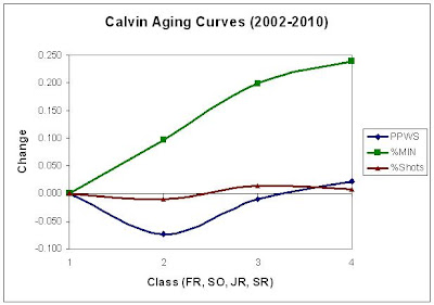
Next I decided to chart PPWS progression with respect to class, because really, players on JV or in JUCO are getting experience at a level higher than high school, so they should be lumped in with guys of their same class. The results are as follows:
Here we see the funky second year dip return, but now it's even more prominent than it was previously. A quick check of the data set shows that we only have six guys in this sample (Joel Hoekstra, John Mantel, Dustin Smith, Caleb Veldhouse, Matt Veltema, and Tyler Zoerhof), and they're getting pounded becuase Joel couldn't keep pace with his monster 1.315 freshman year in his second season, which is more than understandable. If Joel had merely been league average that year, we'd see the blue dot go from the -.073 we see now to around -.02. Sample size issues indeed.
Aging Curve By Class: Sophomores through Seniors
Since the large dip in the graph above obscures the curve, I decided to set the sophomore year as the zero baseline (ignoring any freshman year stats) to try to get a clearer picture on how players progress into their junior and senior seasons. This is presumably when the're contributing the most to the team's success. Basically we just take the graph above and translate the curves up or down so that they intersect the x-axis at year two (sophomore year).
This graph looks a lot like what I envisioned the aging curves looking like when I began this project. We see a nice incline in both %Min and PPWS in the junior season, and a slightly flatter incline for the senior season. The average increase in PPWS that our sample set saw between their junior and senior seasons (.09) is good enough to turn an average MIAA player (1.01 PPWS) into an average Calvin player (1.10), or turn an average Calvin player into one of the top two guys on the team.
Of course, PPWS doesn't say everything about an individual's offensive abilities, but it does say quite a bit.


